Autodesk Shotgun Onboarding Experience
Shotgun is the industry-leading film studio production tool used by creative teams in motion picture and gaming industries. The primary goal of this project was to retain trial customers with better onboarding and in-line help and learning.
Shotgun had a conversion rate lower than 7% after user went through 30 days trial. It is in that first moment — the first use of Shotgun. That is where the biggest potential for improvement lies. Our goal was to ensure a successful onboarding experience.
Team
2 UX Designers, 2 Creative Directors
Duration
3 months
Ramp Up
In our first weeks, we reviewed materials from Shotgun team, including initial prototype, brief, book/article suggestions, Shotgun brand thinking, tested the current product first-run UX and the human interface guidelines (HIG).
We also did a competitive analysis. We comparatively reviewed a handful of first run and trial onboarding experiences in other products and services. By analyzing existing solutions, we learned that good onboarding experiences balance the how–to with the why. They demonstrate product value through usability and usefulness.
We honed in on aspects from a few that help them stand out and that we feel are relevant inspiration to Shotgun as we move forward.
Understand core experience
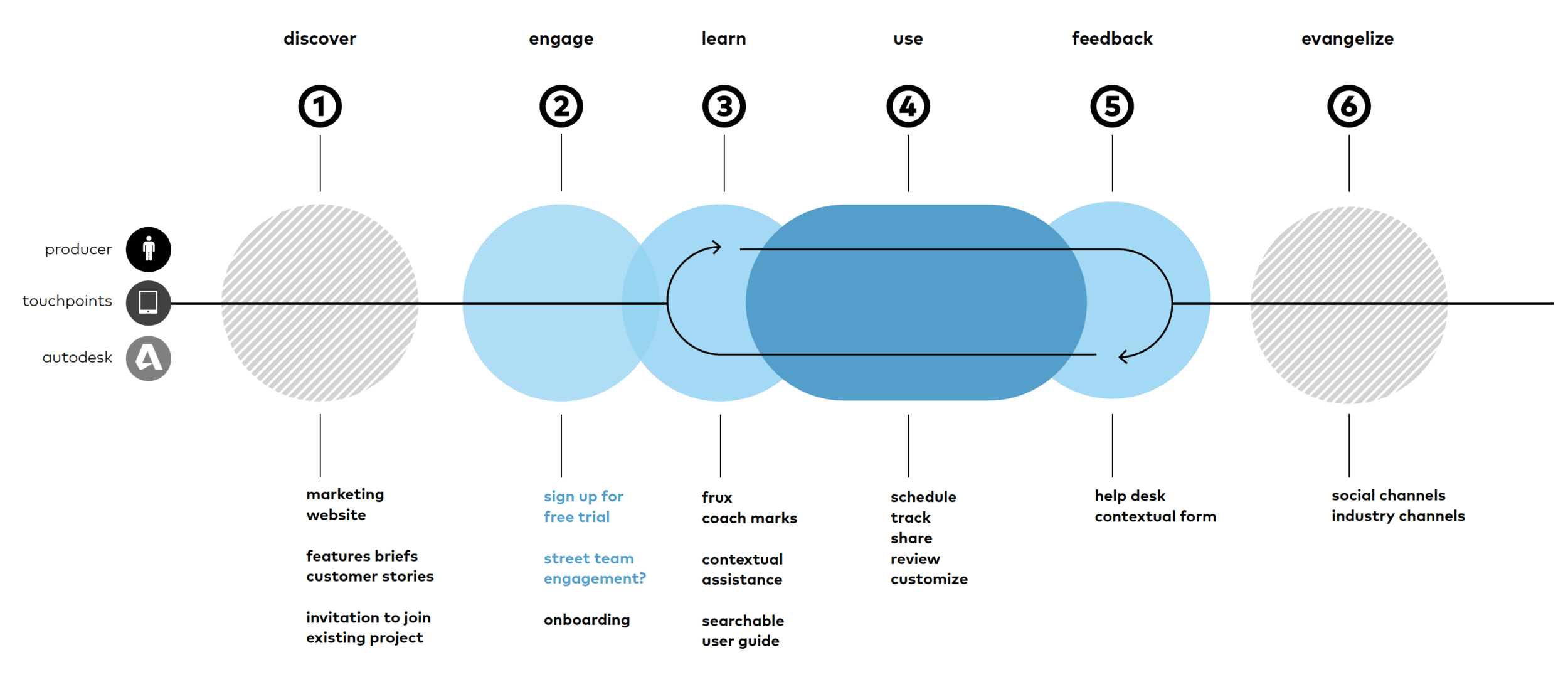
By going through high-level user journey, we realized that Shotgun is a much more complex tool than most of the products we analyzed earlier. It has a steep learning curve and the true value reveals when the whole team is onboarded into projects.
In order to amaze users from the first sight but also equip them with tactical knowledge to utilize the tools, we determined two main experience principles:
Experience Value
Tell the value story upfront.
Early onboarding experiences should be fun, easy & rewarding.
Users should feel like they are getting somewhere fast.
Focus onboarding on getting customers to a state of realized value as quickly as possible.
Learn by Doing
All information is contextual based on where any given person is in a project.
Informational assistance is accessible at any point in time.
Information is relevant and easy to understand no matter when a user is onboarded.
Break into steps
With the insights above, we dived a layer deeper into the actual steps user would go through when onboarding. To make the onboarding journey progressive and contextual, we broke these information into four parts:
Guided Tour
To grasp users’ attention from the first moment, a guided tour shows off Shotgun’s value propositions to excite the users of what this powerful tool can help them achieve.
Getting Started Mission
Once users get into Shotgun UI, the pop-up modal helps them get a better sense of where the key controls are at. It reinforces their muscle memory on where to find what.
Self Guided Learning
Users can decide whether they want to learn more. We designed learning topics in the side panel and introduced the idea of “tip of the day“ to sprinkle secondary functionalities to support the further learning experience.
Help & Support
We incorporated FAQ and live chat support into the side panel for users to get instant help while keeping the workspace environment.
Getting into the nitty gritty
It required an unexpected effort to mock up the entire user journey. To illustrate the entire journey of onboarding, we had to take screenshots from Shotgun’s current UI, then add the onboarding layer on top of it. It was not the most efficient way to communicate preliminary design ideas. To solve that problem, I designed in the form of task flows to quickly communicate with colleagues and clients about my high-level thinking.
Design behind the experience
Every team is different. This concept also applies to Shotgun users — a movie production team has distinct needs from a game character design team. That said, every producer may require different set of onboarding missions.
We designed a content management system (CMS) for users to easily update the onboarding content. This tool can also be used by Shotgun team to update default modules and topics for early adopters. There’s even a broader vision of maybe this tool can be utilized across Autodesk suite of products. Following is the design principle for the CMS tool:
Tools for Teaching
Empower the Shotgun team to create, manage, evolve and deploy learning modules and topics directly.
Build a powerful CMS tool for learning that can scale across Autodesk and be used by all.
Allow Shotgun users to build and manage custom learning topics tailored to their needs
We determined that In-line tool allows content producers to create, edit and publish learning content without the need of an engineer. The tool is designed to create all the necessary components of the learning system.
Follow the system
Autodesk has its own human interface guidelines developed. Mostly, we followed the guidelines by adopting components and grids defined in Autodesk HIG.


